Reading a geo-grid without fooling yourself
A grid gives you nine, twenty-five or forty-nine numbers where you had one, and draws them on a map. That is a real upgrade with a real hazard: twenty-five numbers and a coloured picture feel like data in a way one number never did, so nobody audits them.
Two summary figures get quoted, a month later two more get quoted beside them, and the difference gets called a result.
This chapter is the audit — what the two figures hide, how much a grid disagrees with itself when nothing has changed, and how large a movement must be before you may call it one. You should finish able to say to a client: "That change is inside our measurement noise, so we are not counting it."
Two figures, two denominators
The app prints two numbers under the map. They are not two views of one thing.
| Figure | Numerator | Denominator | Therefore |
|---|---|---|---|
| Avg rank | Sum of your positions | Points where you appeared | Grey pins are deleted before the arithmetic |
| Top-3 coverage | Points where you ranked 1–3 | All points scanned | Grey pins count against you |
One excludes the missing data, the other counts it as failure, so the two can move in opposite directions on the same scan and both be correct.
The consequence is the mechanism by which grids flatter people, and it deserves to be a rule.
Average rank improves when you disappear from your worst points.
Vanish from three pins where you sat at #18 and the average climbs. Nothing improved — the instrument stopped looking at your bad neighbourhoods.
A third figure makes the other two safe. The plain-language paragraph above the map states it: "You appear in the top 20 at 9 of 25 points." That is the found rate, the denominator information the average threw away. Quote it every time, first.
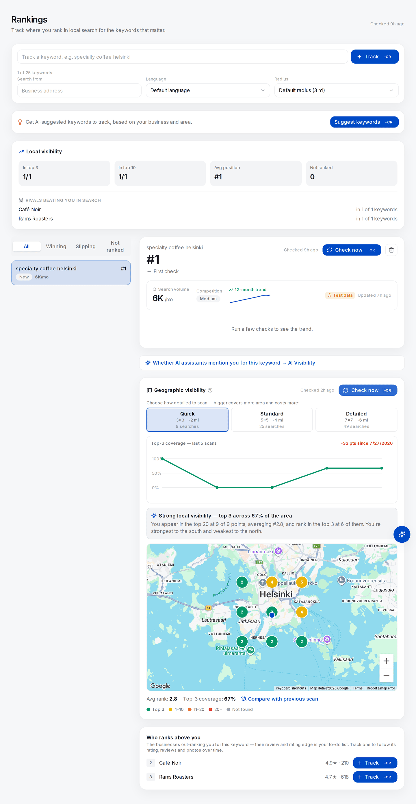
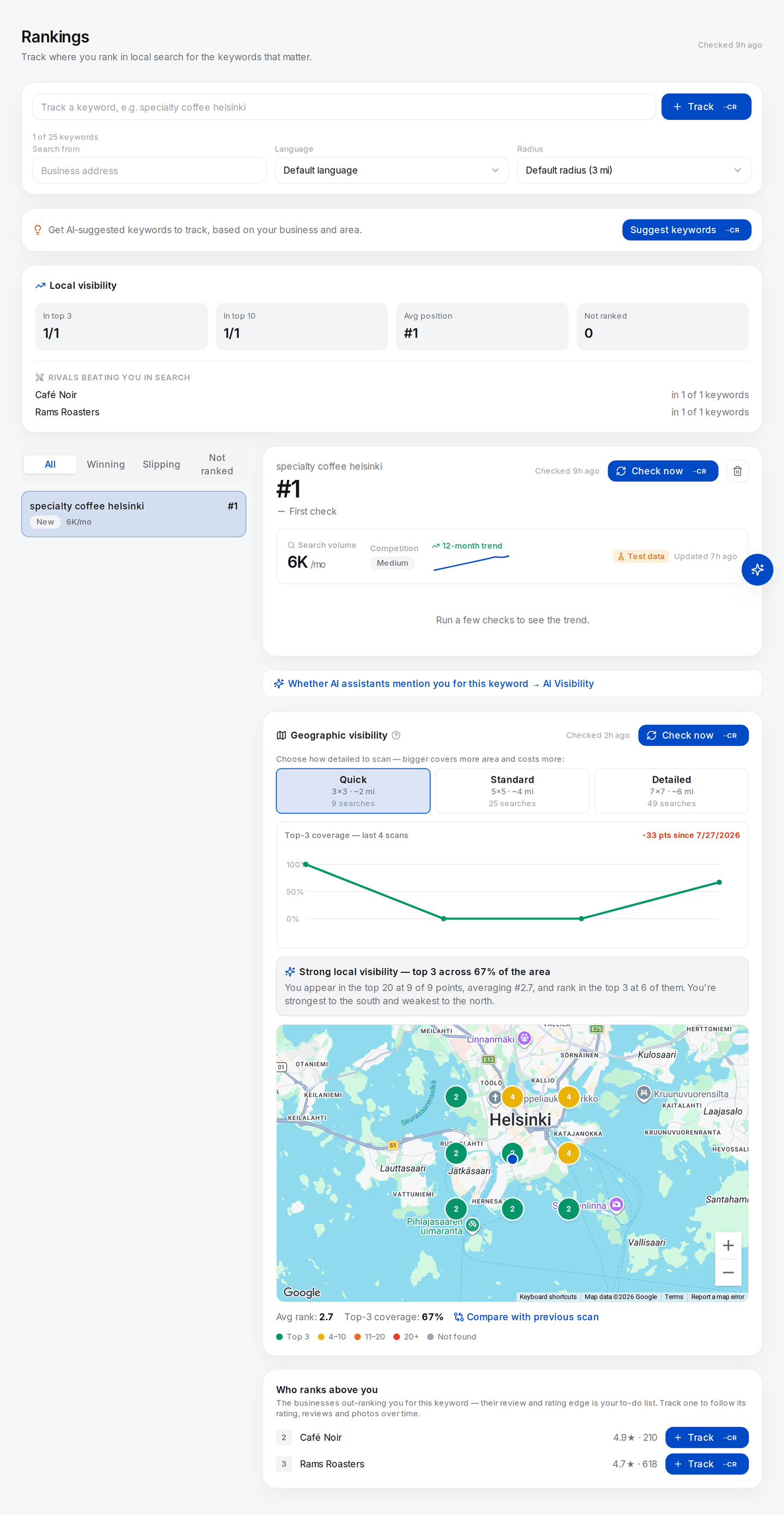
The whole argument on one screen, and a real scan — Check now at the Quick preset ran nine live searches, one per point, and each pin carries the position that point returned.
Read the figures in order. The plain-language line first: found in the top 20 at 9 of 9 points. Then Avg rank 2.8, computed only over the pins where the business appeared. Then Top-3 coverage 67%, computed over all nine. Three numbers, one set of nine measurements.
Now read the trend strip above the map, because it is the more important object on this screen. It plots five scans of these same nine points, taken across a single day: 100%, 0%, 0%, 67%, 67%. No profile edit, no new review, no competitor move — the business did nothing at all between them. The header even prints a verdict on it: -33 pts.
Any two of those five could be presented as a quarter's work. Take the third and the fourth and you have "top-3 coverage up 67 points". Take the first and the second and you have a catastrophe to pin on an algorithm update. Both are honest arithmetic on real measurements. Both are worthless.
This is not a defect in one vendor's tool — it is what sampling a discontinuous sort looks like. It is also why the rest of this chapter exists, and why Lab 18.2 makes you measure your own noise floor before you report a single movement.
(The search-volume card higher up the page carries a Test data badge — those figures are placeholders, not market data.)
Rank is ordinal, and an average of ordinals is not a distance
Position is a rank label: only the order is real, the gaps are not. Arithmetic does not know that. To a mean, #1 → #2 and #11 → #12 are the same one-position event; in the world the first moves you inside the only box most people see and the second moves you from invisible to invisible.
You may average ordinals — everyone does, and this app does — but not believe the answer without saying what you did to get it.
Three summaries survive scrutiny better:
- the found rate — appeared at R of N points;
- the top-3 count — ranked 1–3 at T of N, the only threshold that pays;
- the distribution — pins per band, four counts summing to N, carrying everything the mean carries plus the shape it destroyed.
The map already colours those bands.
A grey pin is censored, not bad
A grey pin does not mean rank 21. It means the scan reads twenty deep and you were not in it, so your true position is somewhere worse than 20 — 22, or 400, or not eligible for that query at that point at all. The instrument cannot tell those apart.
The red band is a red herring. The legend of a finished scan carries a red 20+ band, but the scan asks for twenty results and stops, so nothing can come back holding a position past twenty and that band never fills. The grey pins themselves print 20+ as a label, which reads like a position and is not one. Only the example panel fills the red band, because it draws its one unranked point there instead of grey.
Statisticians call this right-censoring, and there is no clever fix. Every summary must do something with those pins, and each choice produces a different number from the same measurements.
Watch one worked example travel — illustrative figures, not a real business. Twenty-five points; you appear at nine, at positions 1, 2, 2, 3, 5, 7, 11, 14, 19; sixteen grey.
| Scoring choice | Arithmetic | "Average rank" |
|---|---|---|
| Exclude the grey pins — what the app prints | 64 ÷ 9 | 7.1 |
| Impute 21 — one past the depth, the least bad value consistent with the fact | (64 + 16×21) ÷ 25 | 16.0 |
| Impute 50 — a guess at how far outside they really are | (64 + 16×50) ÷ 25 | 34.6 |
| Do not average | — | Found at 9 of 25; top 3 at 4 of 25 |
Same scan, same twenty-five searches, and an "average rank" of 7.1, 16.0 or 34.6 depending on an assumption nobody in the room knows you made.
The first row is what every grid dashboard shows, and the most flattering by a factor of five. The fourth row is the answer: it assumes nothing about the censored pins, which is correct, because you know nothing about them.
The app itself makes the "impute 21" choice in one place: the compass sentence averages by direction and counts a missing pin as 21, and claims a direction only when best and worst are at least two positions apart. So no direction claimed means "not a big enough gap", not "no gradient".
The panel shows you all of this before you have run anything, using stand-in numbers:
Placeholders, and the app says so: the banner reads Example scan — pick a detail level above and press Check now to map your real positions. Do not read 32% or #7 as a measurement of anything. What is real here is the furniture, and it is the furniture this chapter is about — the two figures on different denominators (top 3 in 32% of the area, over all 25 points; avg rank 7, over the 24 where the business appeared), the colour bands the pins are drawn from, and the compass sentence, "strongest to the west and weakest to the south-east", which is the one place a missing point silently becomes a 21. Two details of the example are not how a finished scan behaves: it labels the coverage figure Visibility where a real result says Top-3 coverage, and it draws its one unranked point in the red 20+ band where a real result would show grey Not found — the distinction the next section is entirely about.
Next: Bias, noise, and the smallest change worth reporting →